Supporting 600+ government staff with role-based access—one reliable backend for MoF lottery operations.
Summary
600+
Role-based access control
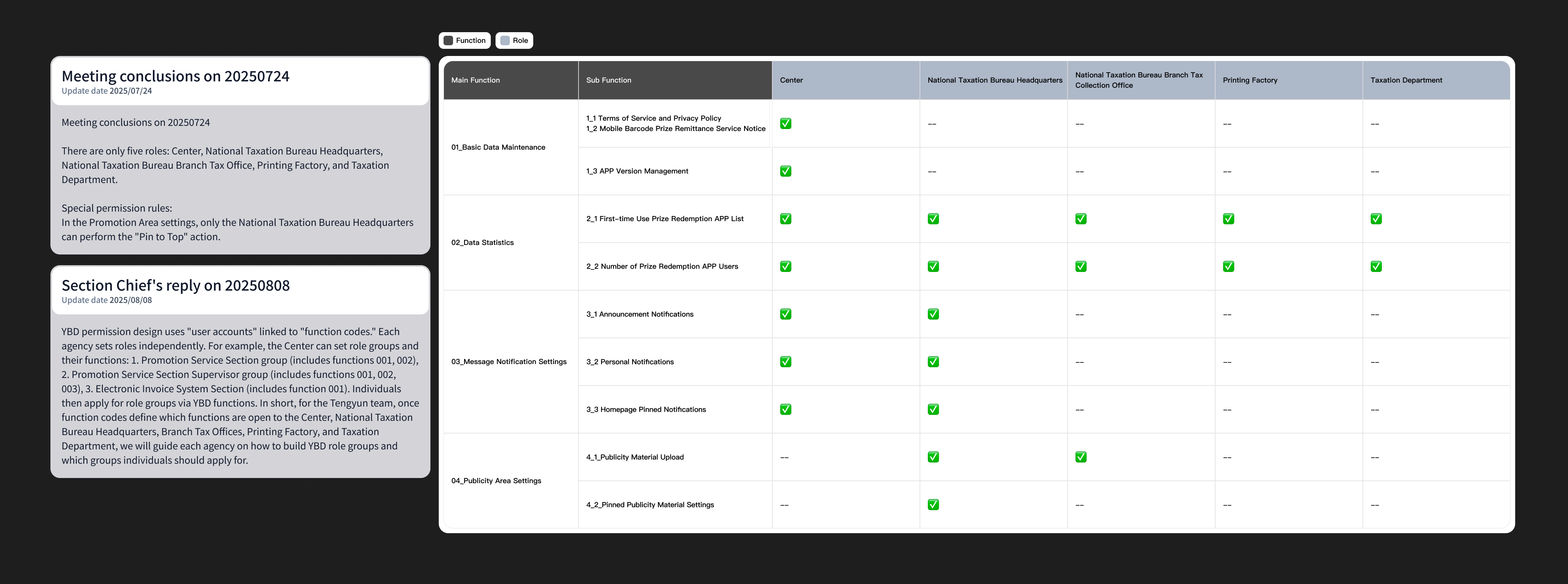
I designed a role-based permission system that aligned responsibilities across departments. By hiding inaccessible features and limiting high-impact actions to specific roles, the platform enabled teams to work independently while preventing conflicts that could affect public-facing content.
Reporting
CSV
Self-service dashboards
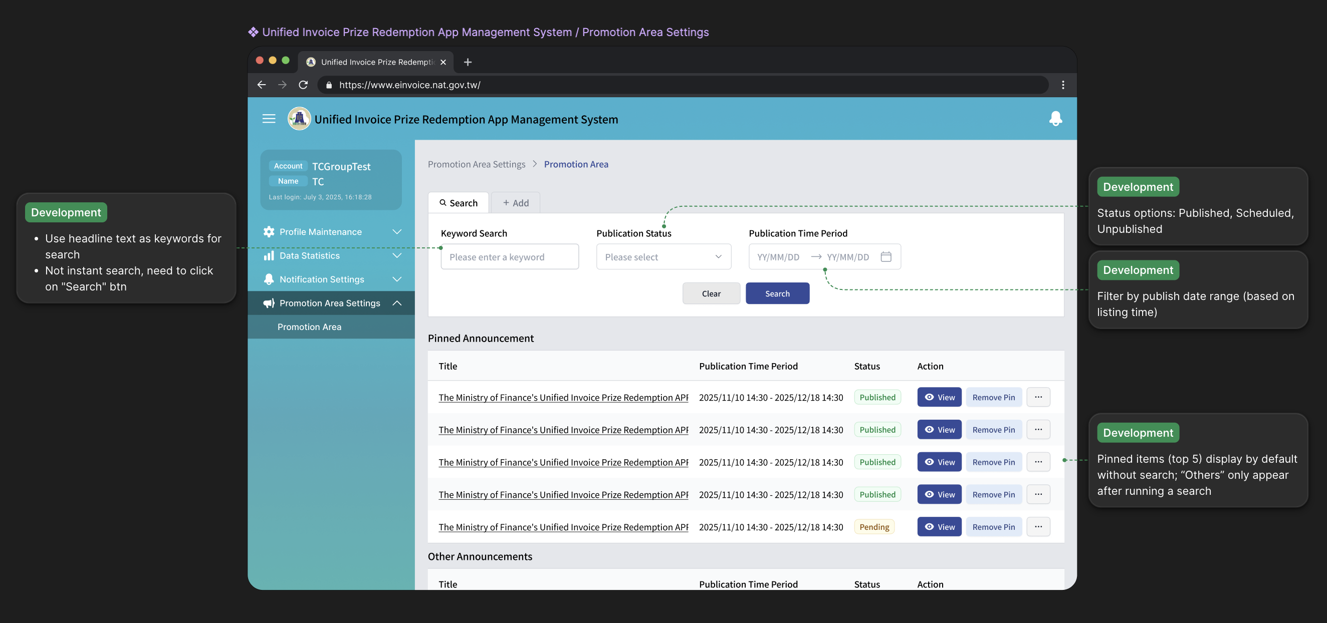
I redesigned reporting into an actionable dashboard with weekly and monthly views, time-based filters, and CSV export. Staff could prepare reports independently for meetings and audits, reducing reliance on engineers and speeding up operational workflows.
System logic
Ship
UI decisions under constraints
Working closely with engineers, I designed backend flows that balanced flexibility and stability—such as version control with mandatory update settings and build-code mapping—so critical updates could be enforced quickly without risking system inconsistency.

After the public lottery app shipped, MoF needed a single backend for announcements, promos, push rules, reporting, and app versions—used by 600+ people who expect the same familiarity as other government systems.
Example of corresponding screens
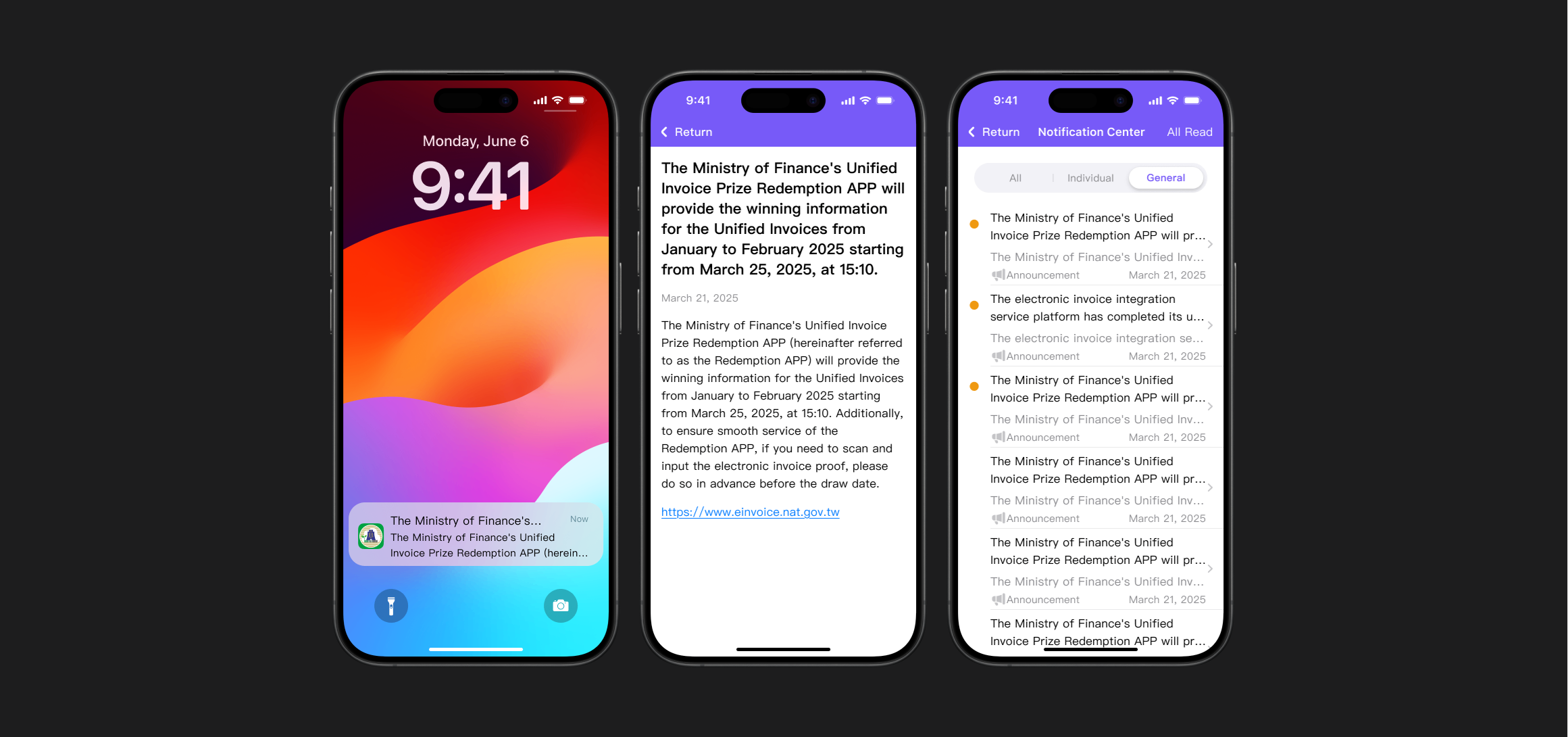
Staff compose notification content in the backend, set publish timing, and schedule delivery in advance. End users receive push notifications, then open the in-app notification center and message details—aligned with those backend rules.
How I aligned design with engineering
I defined a clear set of principles for access: which roles could see which features, and how permissions should differ. If a role had no access to a feature, that feature simply did not appear in their sidebar.