TL;DR

Shipped for 20M+ users · 5 user segments including low-vision and foreign residents · Taiwan Ministry of Digital Affairs certified

Scale

20,000,000+ users

Taiwan National Public Service

Mechanisms

24% → 18%

Reducing missed prize redemptions

Client-reported share of missed top-tier prize redemptions: about 24% before ship, 18% one month after launch—directional internal read, not a published MoF figure.

Testing scope

88%

Task success across ages

Moderated prototype usability testing sessions with users 18–70+, including visually impaired participants, on scan, donate, and redemption.

E-invoice app redesign mock — screen 1
E-invoice app redesign mock — screen 2
E-invoice app redesign mock — screen 3
E-invoice app redesign mock — screen 4
01 · The problem

Roughly 20 million people rely on this official app, yet only 2.8★ App Store ratings and broken flows were excluding elders, newcomers, and low-vision users.

Context and design goal

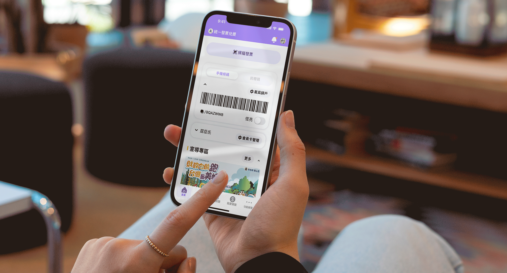
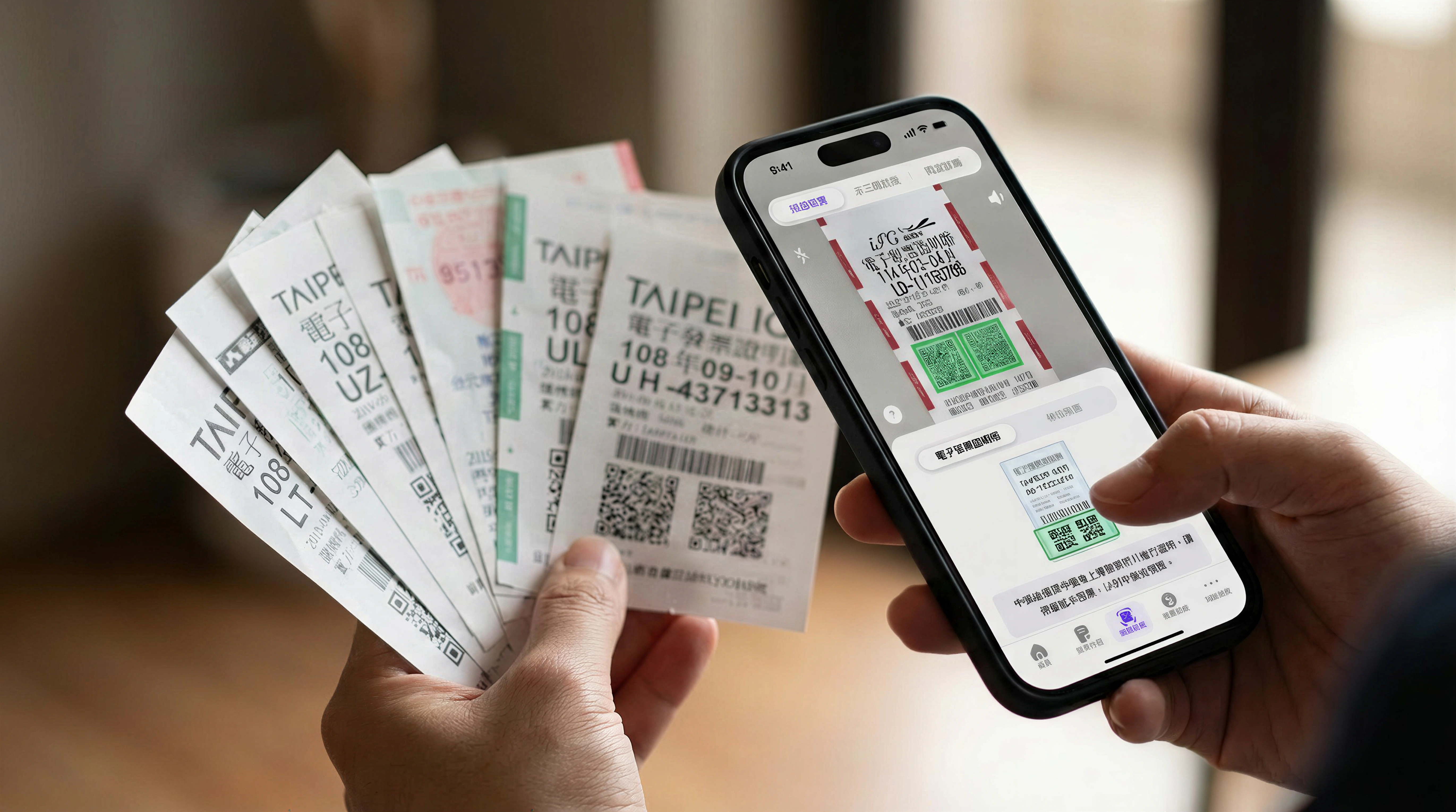
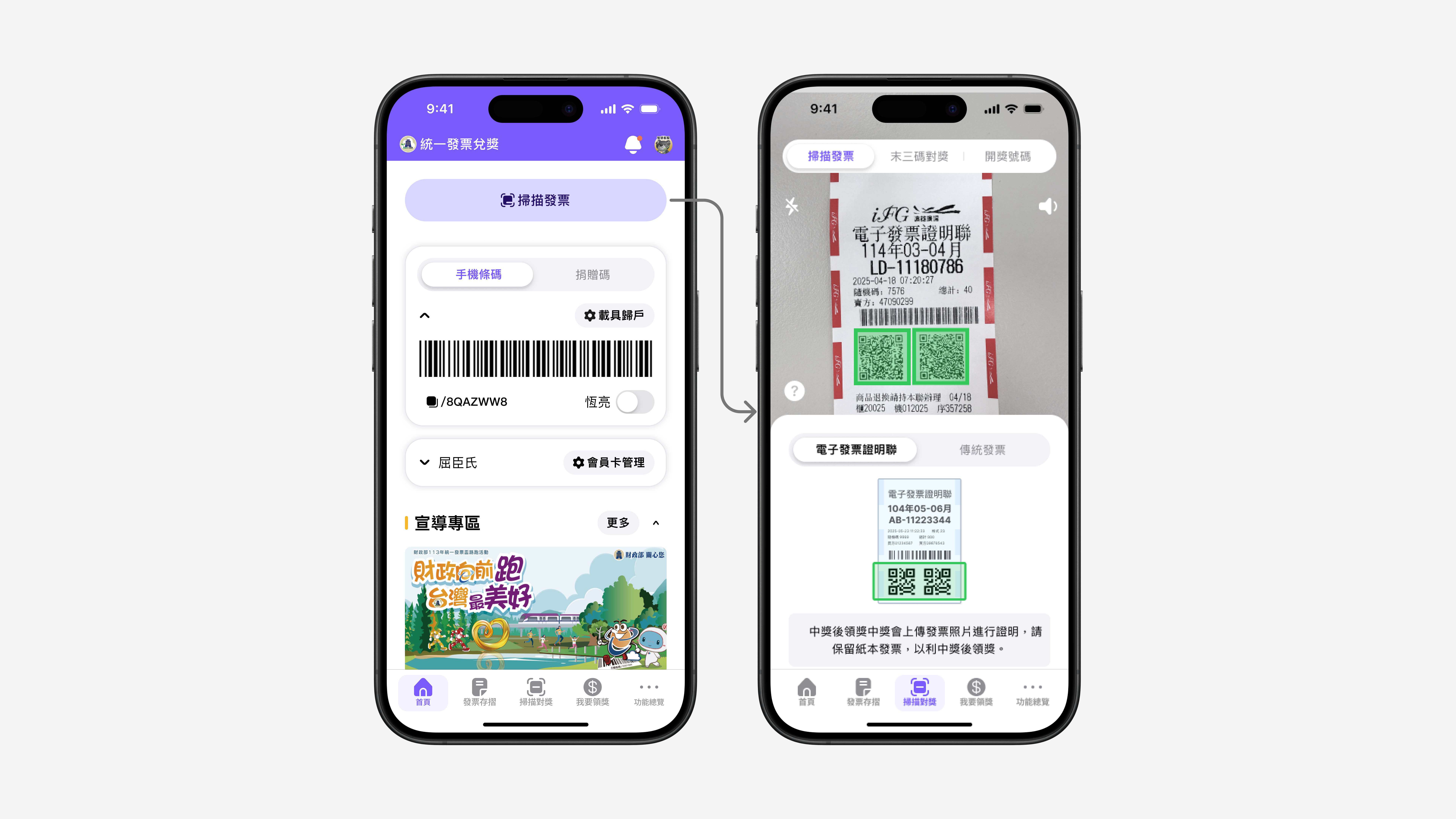
In Taiwan, retail purchases always come with a uniform invoice (統一發票), often paper with a lottery number and QR code. The Ministry of Finance cloud invoice / e-invoice ecosystem (電子發票) lets people store digital copies, bind a mobile carrier barcode (手機條碼) for automatic matching, scan paper receipts into the app, and claim or donate prizes.

Design goal: To redesign the information architecture, flow and UI to make those core jobs obvious and trustworthy for elders, newcomers, foreign residents, and low-vision users.
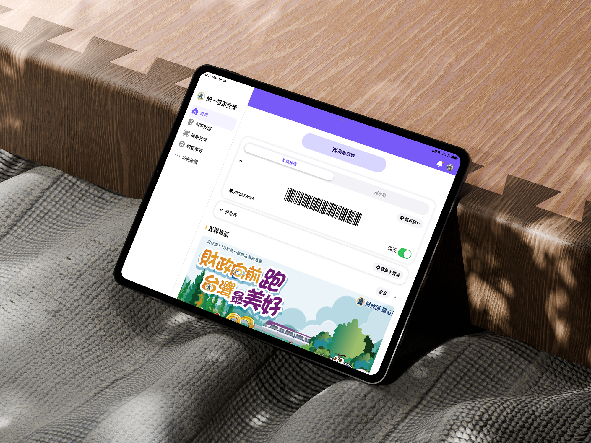
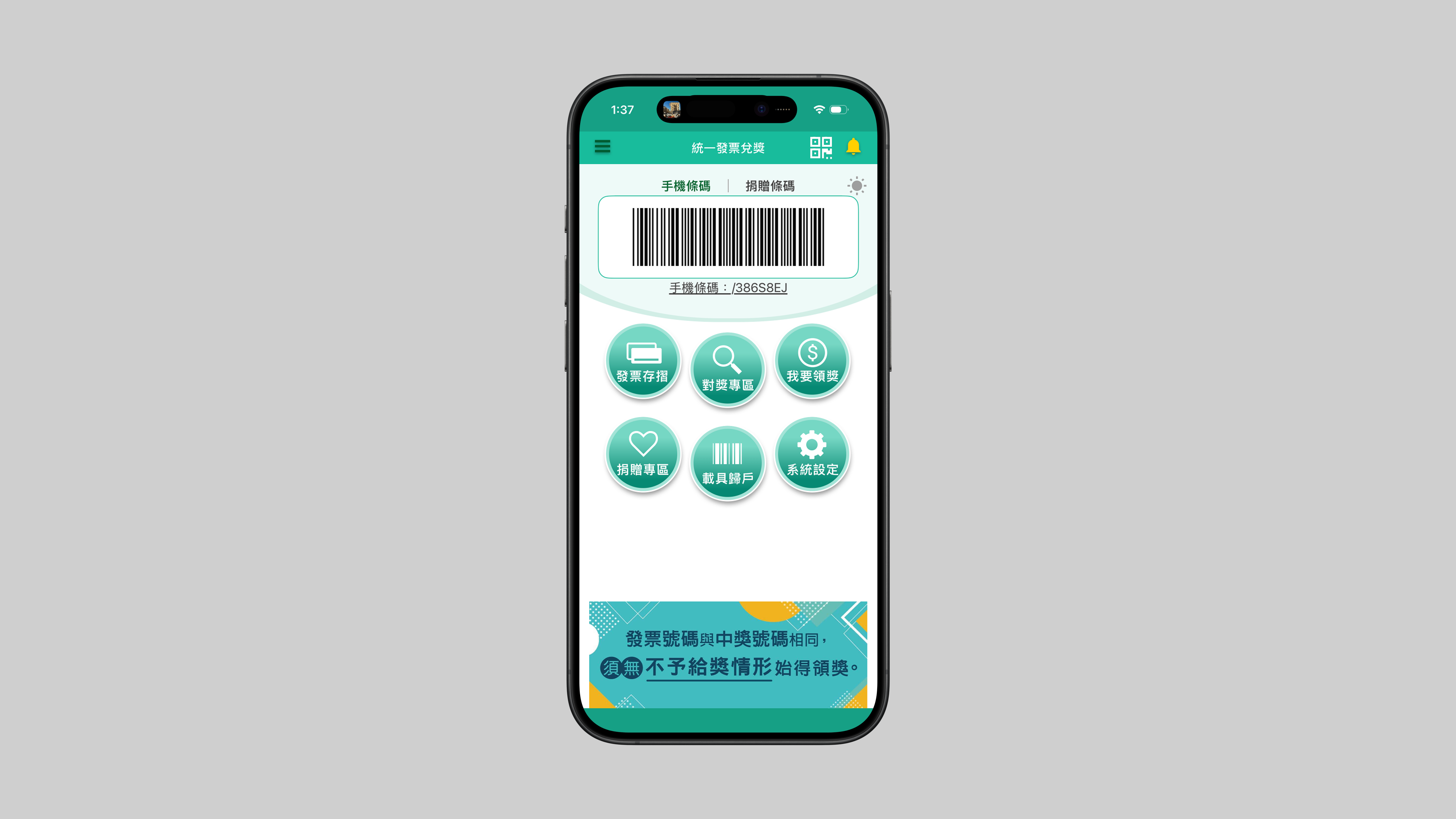
Paper receipts commonly collected for Taiwan's invoice lottery
Spending insights
Membership cards
Settings overview (1/2)
Settings overview (2/2)
Prize claim info
Donation
Carbon passbook share
Guided setup (biometrics, bank, notifications, cloud backup) (1/4)
Guided setup (biometrics, bank, notifications, cloud backup) (2/4)
Guided setup (biometrics, bank, notifications, cloud backup) (3/4)
Guided setup (biometrics, bank, notifications, cloud backup) (4/4)
Redeem security check
Invoice passbook
Receipt detail
Homepage
Face ID / quick verification
Last-three-digit match
Events & promos
Winning invoices
Paper receipt scan
Notifications
Solution 1

The Homepage

Problem

Users opened the app and couldn't find what they needed.

Five very different user segments, all frustrated for different reasons.
Key insight

Every group shared one first action: scan a paper invoice.

Seniors especially have a lot of paper invoices to scan. At checkout, cashiers assumed elderly don't use the e-invoice app and handed them paper receipts instead.
Decision

Scan became the primary, large, labeled CTA—the first thing on open.

Before: small QR icon, top-right. After: unmissable.
Problem

small Icon-only patterns left foreign residents guessing and many low-vision users couldn't use the app without a caregiver.

Key insight

1. Foreign residents needed readable text to decode controls—not icon-only cues.2. Low-vision users needed predictable, stable placement and large, labeled CTAs instead of small icons.

Decision

Large tap target + readable text label + fixed placement.

One pattern served both groups—including labels that don't assume Chinese literacy.
Outcome

Prototype testing with the same participants validated the scan-first, inclusive home direction.

Strong positive responses across ages—especially seniors.

BeforeAfterAfter redesign: app home with scan invoice as the primary action and barcode module; iOS home screen widget shows carrier barcode for quick access
Cloud Invoice app home — before redesign
Solution 2

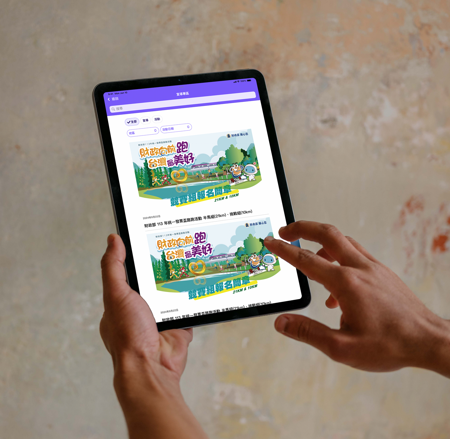
Pushback with external stakeholders: promo-first vs. what users actually open the app for

Problem

External stakeholders wanted the sustainability outreach zone to dominate on open. However, interview evidence suggested a different set of priorities first.

Government partners cared deeply about low-carbon messaging and wanted the sustainability promotion area to lead the home screen.What showed up consistently in interviews was a shared priority order: a prominent scan paper invoice action first; then the in-app carrier barcode for people who don't use iPhone or Android home-screen widgets and need to show the code as soon as they open the app; then not missing prize / lottery information for younger and middle-aged users; then spending analysis for younger users—often richer here than in standalone budgeting apps. The outreach zone wasn't among the top reasons people launched the app. Prototype testing fed back the same story.
Key insight

Same home layout, two incompatible defaults across age.

Older and low-vision groups wanted fewer modules, more whitespace, and strong color for quick recognition. Younger groups wanted a denser dashboard—more modules, promos, and shortcuts—and a cooler, minimal palette.
Conflict

I brought interview evidence into government stakeholder meetings to push back

I understood their need to surface carbon-reduction messaging and policy outreach—but the data said job-first ordering had to win the first screen. That was the argument I used in the room.
Resolution

A customizable home: section visibility toggles in Settings.

Users can turn individual home sections on or off—for example, someone who only wants the scan control and the sustainability outreach block can hide the rest, so the promo block still gets the space they care about without forcing that default on everyone. Partners accepted the model.
Outcome

Across scan, donate, and redemption—including visually impaired participants and mixed ages, the usability sessions reached 88% task success.

Solution 3

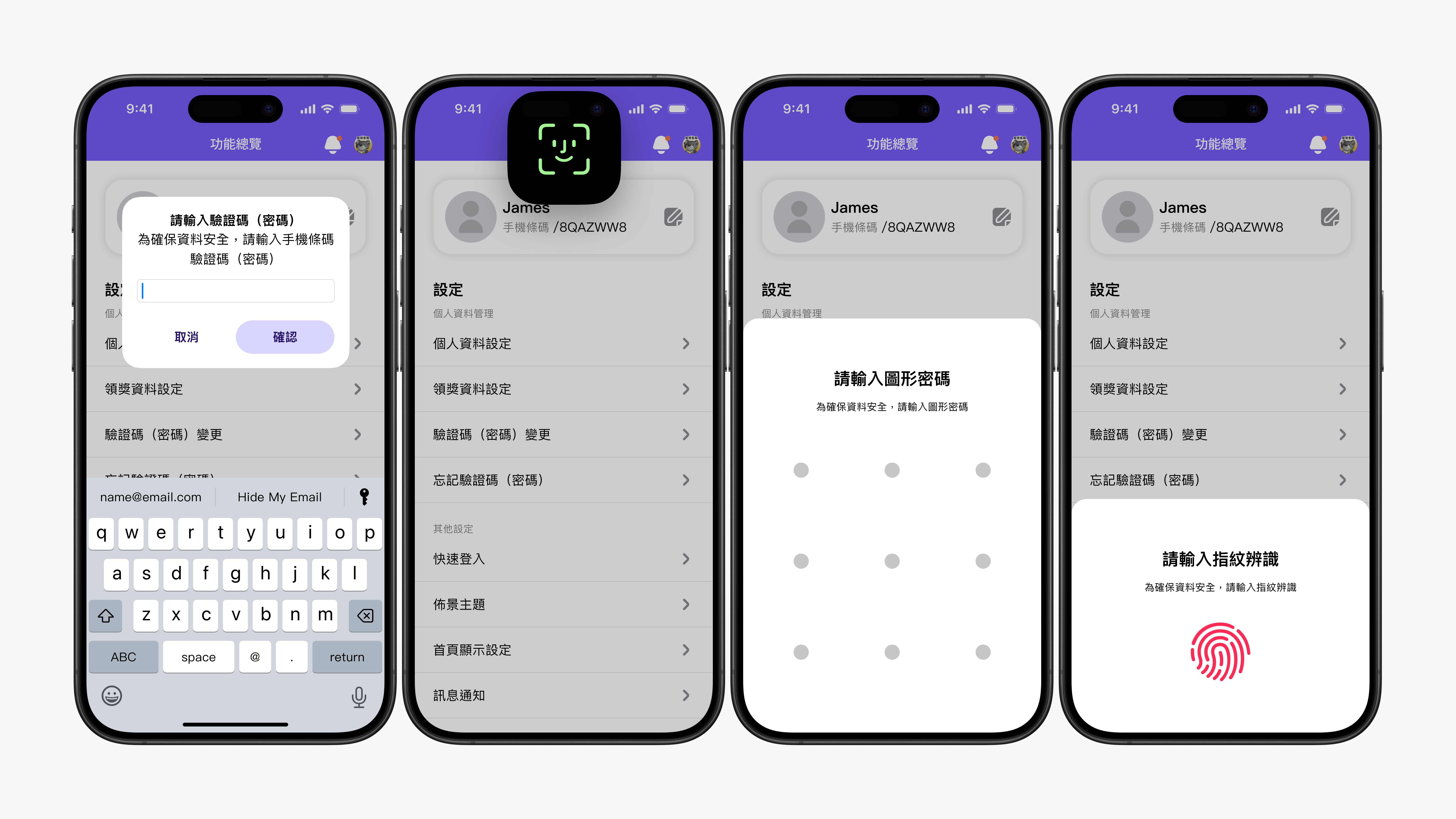
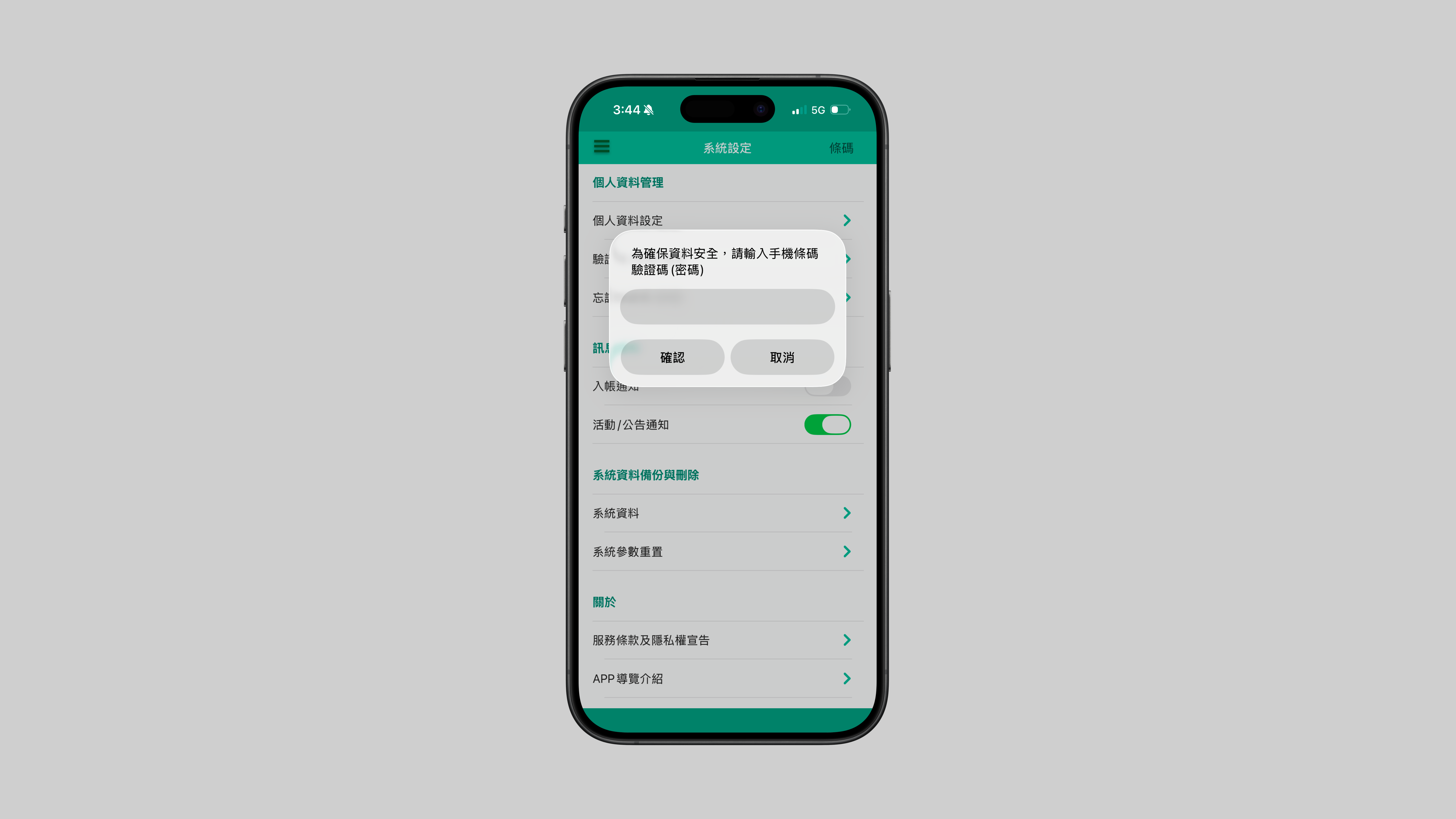
Login & authentication

Problem

Authentication was secure, but middle-aged and senior users kept forgetting their verification passwords

Login success hovered around ~68%. MoF verification codes and recovery friction blocked them before any core task.
Decision

Ship biometric login and in-app password recovery.

People could get back in without memorizing credentials or hunting a one-time code.
BeforeAfterAfter: Face ID, Touch ID, and pattern unlock options for Cloud Invoice app login
Before: password-only verification modal in system settings
Solution 4

Guided Onboarding Setup

Problem

Many lottery prizes go unclaimed because people don't check, miss alerts, or never set up auto transfer.

About 1/4 major lottery prizes are never claimed. People forget to check, miss notifications, or use cloud invoices without linking a bank account for automatic payouts. Many foreign residents don't know auto-transfer exists or how to set it up. Seniors and foreign residents often didn't complete auto-transfer or biometric setup because they weren't aware of these features or how to enable them.
Decision

Guided onboarding & English version for foreigners

Biometric setup → bank account for auto-transfer → notifications → cloud backup—each step explained why it mattered, not only what to tap. I also shipped an English-language experience for foreign residents.
Outcome

One month post-launch, client-reported missed top-tier prize redemptions moved from about 24% to 18%.

Handoff & engineering alignment

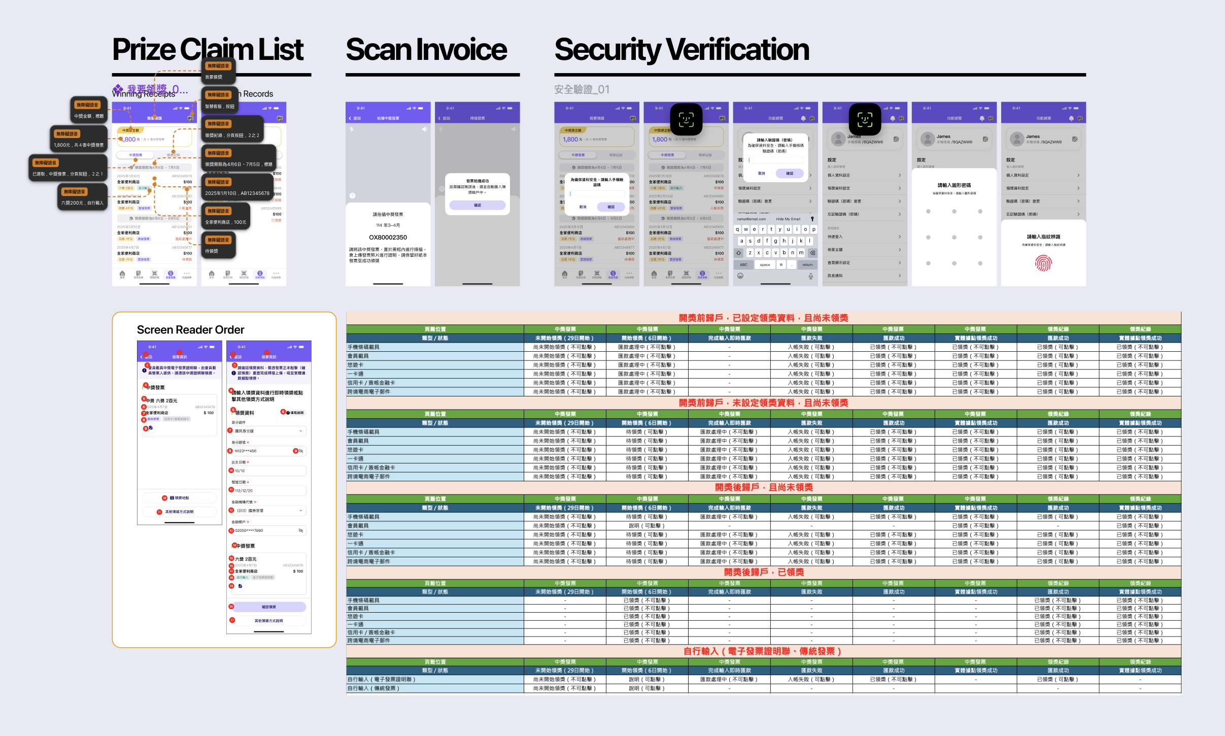
Handoff included three layers:

  • API state matrixEach flow mapped against account states and timing windows, so engineering knew which endpoint to hit per scenario.
  • Screen reader annotationVoiceOver focus order marked directly on screens.
  • Component specsStates, empty copy, and error strings per component in the Figma library.
E-invoice design handoff: Figma flows, API state mapping, screen reader annotations, and component specs for engineering alignment
Figma files

Open the source files for wireflows, page logic, and hi-fi mocks in one place.

Hi-fi mockups and page flow first; wireframes and wireflow for IA and early logic.

← Back to home